Update 2021
Since writing this article, The Astra Pro theme for WordPress has been gaining popularity. The free version is being used on more than 1,000,000 websites and you can extend the functionality by upgrading to the pro version of the theme. Both versions fully supports the Astra Page Builder Plugin.
If you want to find out more and how it compares with Divi, take a look at the WPCITY article, Divi Theme vs Astra Pro 2021: Which One Is Best for You?
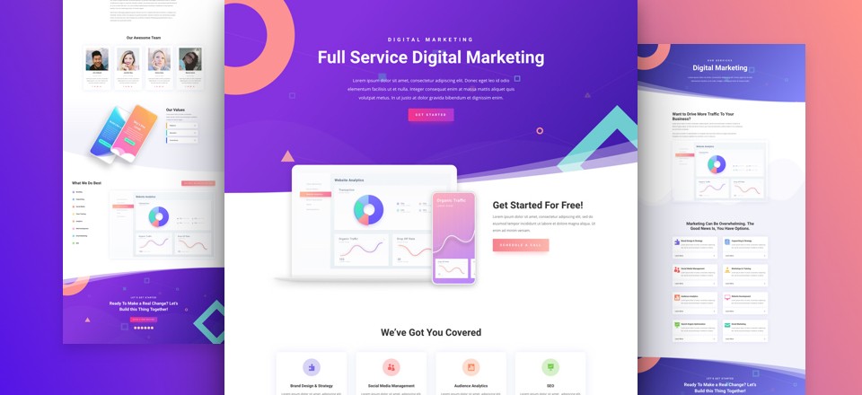
Unfortunately or not, the Divi Theme uses huge thumbnail images when displaying your blog posts or when you are using the blog module in the Divi Builder.
As in Eileen’s case, my client wanted to have blog post listing to have more of a traditional look with smaller images on the left and the text on the right.
In order to achieve this, you need to go to your Divi Theme Options panel, in the CSS area place this code:
.et_pb_post {
    margin-bottom: 100px;
}
.et_pb_post a img {
    height: auto;
    float: left;
    width: 200px;
    left: 0;
    margin-right: 14px;
    margin-bottom: 10px;
}
@media only screen and (max-width: 980px) {
    .et_pb_post a img {
        float:none;
        width:100%;
        height: 300px;
    }
}
The majority of the code above is the same as Eileen had developed with only a couple of modifications.
- Most of the posts had very little text so they appeared staggered across the screen. Adding line 2 (margin-bottom: 100px;) in the code above resolved this issue.
- I changed line 9 slightly, from padding-right: 14px; to margin-right: 14px;. Using padding worked well for the Divi blog module but left a gap between the image and the frame on the normal blog grid. Using margin resolved the problem.
All of the rest of the advice on Eileen’s post is exactly the same.
Thankfully, I now have a very happy client.
Thank you very much for this post. I spent quite a while on this and even tried Eileen’s code and nothing worked. I put your code in and Voilà, it worked perfectly. Thanks again.
better to change the height in mobile view to 100% otherwise it warps the thumbnail.
height: 100%;
One issue with this is the hover icon and effect is showing in the wrong place, so had to disable this function. If anyone has code fix for that too that would be great!
Hi Dave
Thanks for your input. I have to admit that I did not do much testing on mobile devices. I’ll take a look at the hover problem to see if I can add anything.
Cheers Stuart
That worked a treat!
Many thanks Stuart.
Thank you! I have been spending so much time searching for a fix for this! This totally worked! Some codes I found were close but this one did what I had been trying to do. Thanks again!
Hi Stuart,
This code works fantastic, is there anyway you could provide some CSS to also sink the image in the actual post as well ??
Regards,
Pete
Hi, sorry but I don’t use the Divi theme any longer.
Stuart
Hi Stuart,
Thank you for your reply, and thank you for the code to previously provided. What theme have you moved on to and any particular reason you have moved away from Divi?
I like the versatility of divi however page load times are a little slow always like to hear what other professionals and moved too
Cheers
Pete
Hi, Currently I prefer to use BeTheme from the Muffin Group. https://themes.muffingroup.com/be/splash/. I like the starter themes and once you get used to the page builder it is quite flexible.
Stuart
Hi.
Thank you, it is worked for me.
Do you know how to make smaller image like this on single post?
Thank’s.
Hi, sorry but I don’t use the Divi theme any longer. However, it should be quite easy either through settings for image sizes or some basic CSS.
Stuart
Thank you so much Stuart! I was looking for something like this! Your code works like a charm!
Cheers,
Jelena
I’m happy you found the article helpful.
Thanks, for the code. But now the photos in my post are smaller too… any way to solve it?
Hi, sorry but I don’t use the Divi theme any longer. However, it should be quite easy either through settings for image sizes or some basic CSS.
Stuart
Thank you so much. You have saved me a lot. I was looking for a way to reduce the image size, thank God I landed on your post. It has worked well for me and I am really appreciative.
@media all and (min-width: 981px) {
/*blog image size*/
.et_pb_image_container img, .et_pb_post a img {
max-width: 50%;
vertical-align: bottom;
}
}
This works great because it leave the phone at a large image and the computer at 50% reduced.
Just Modify the max-width to the image size you like.
This is the solution i have been searching for, for a while now, it did something extra i needed. Thank you.
Thank you very much for this post! The code worked perfectly and was just what I was looking for!
Thanks, Stuart,
Worked like a dream. The image became just as I wanted but there is no excerpt of the text on the home page
Thanks for your code! It worked perfactly!!!
So glad I found this article. I really love the Elegant theme but hated the large featured image. This fixed my problem with it. Code worked great.
Thank you for this! The CSS selector also resizes a few images besides the thumbnails but those only show up when I’m logged in. Otherwise works like a charm!
Thanks and be well!
OMG! Thank you! The Divi theme is driving me mad. Absolutely nothing is an easy fix. Except this thanks to you. All love flowing your way. After a day of banging my head against the wall, FINALLY an easy fix xoxo
Glad to be of help. Good luck with your new website.